Aubrume - Brand Identity
A brand identity for an AI travel companion that helps people feel a destination before they go, combining dreamy digital-impressionist imagery, a soft editorial system, and a product-first visual language for atmosphere-led discovery.
Branding

Project Overview
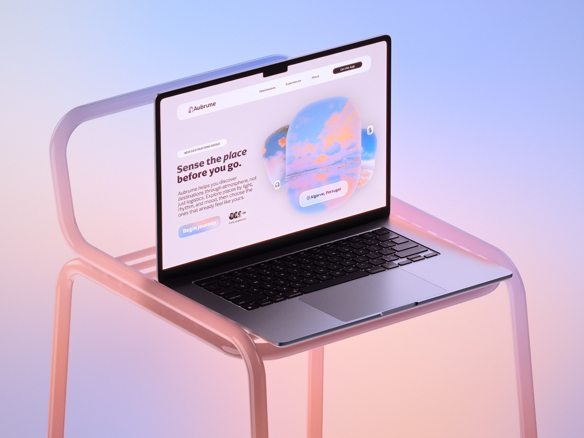
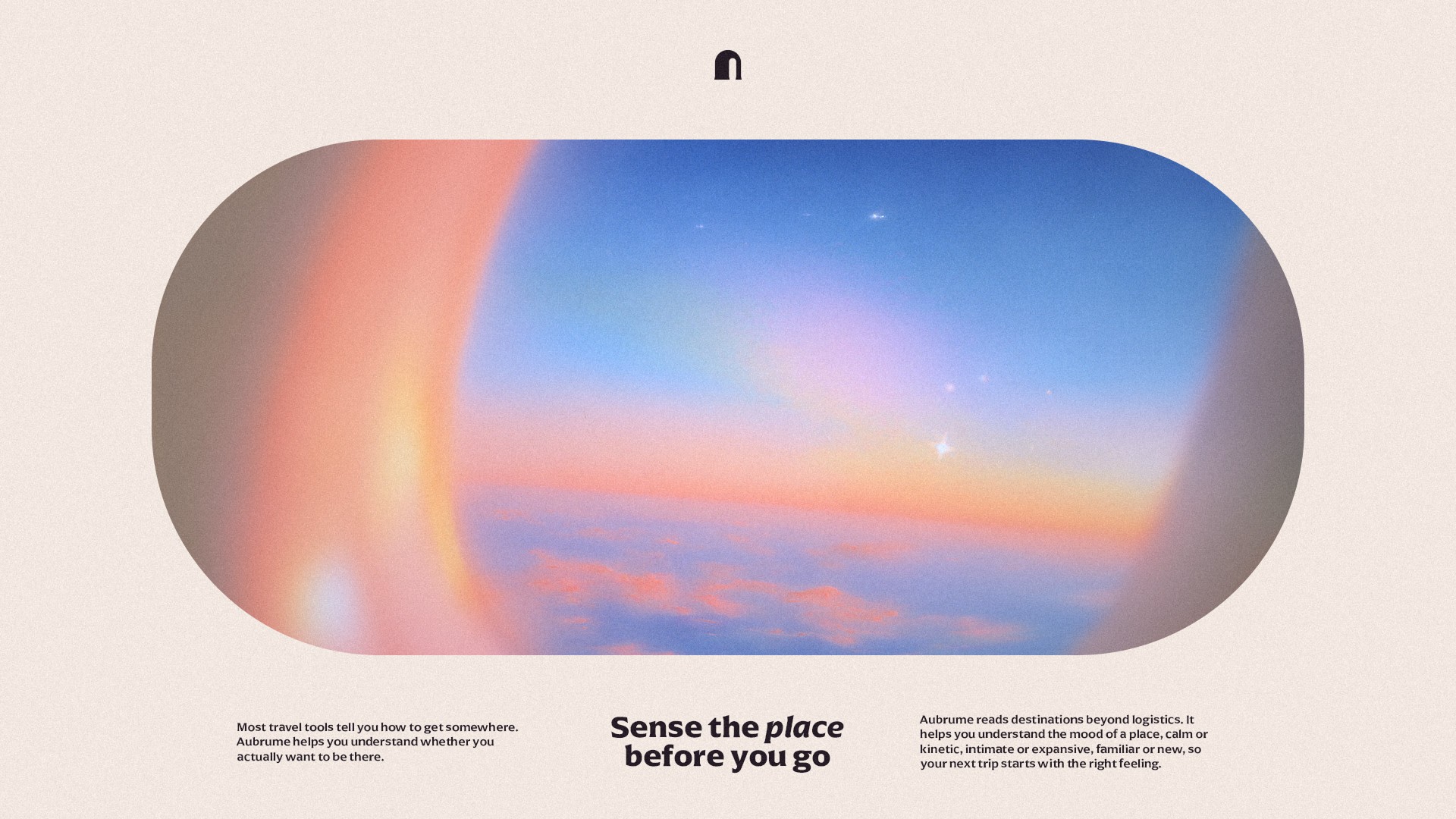
Aubrume is an AI travel companion designed to help people sense the atmosphere of a place before they decide to go. Instead of focusing on booking, price comparison, or itinerary planning, the concept is centered on emotional fit: how a destination might feel in terms of light, pace, rhythm, and mood. The goal was to build a brand system that felt calm, digital, and believable, while still leaving room for projection, emotion, and imagination.
The project followed the same creative workflow I use across my broader branding process, moving through positioning, art direction, logo development, typography, color, imagery, and brand application. Throughout the process, I combined strategy, visual exploration, and AI-assisted experimentation to move quickly through different possibilities while keeping the final direction cohesive and intentional. The aim was never to let the tools define the work, but to use them to expand visual thinking, speed up iteration, and support better creative decisions.
Logo
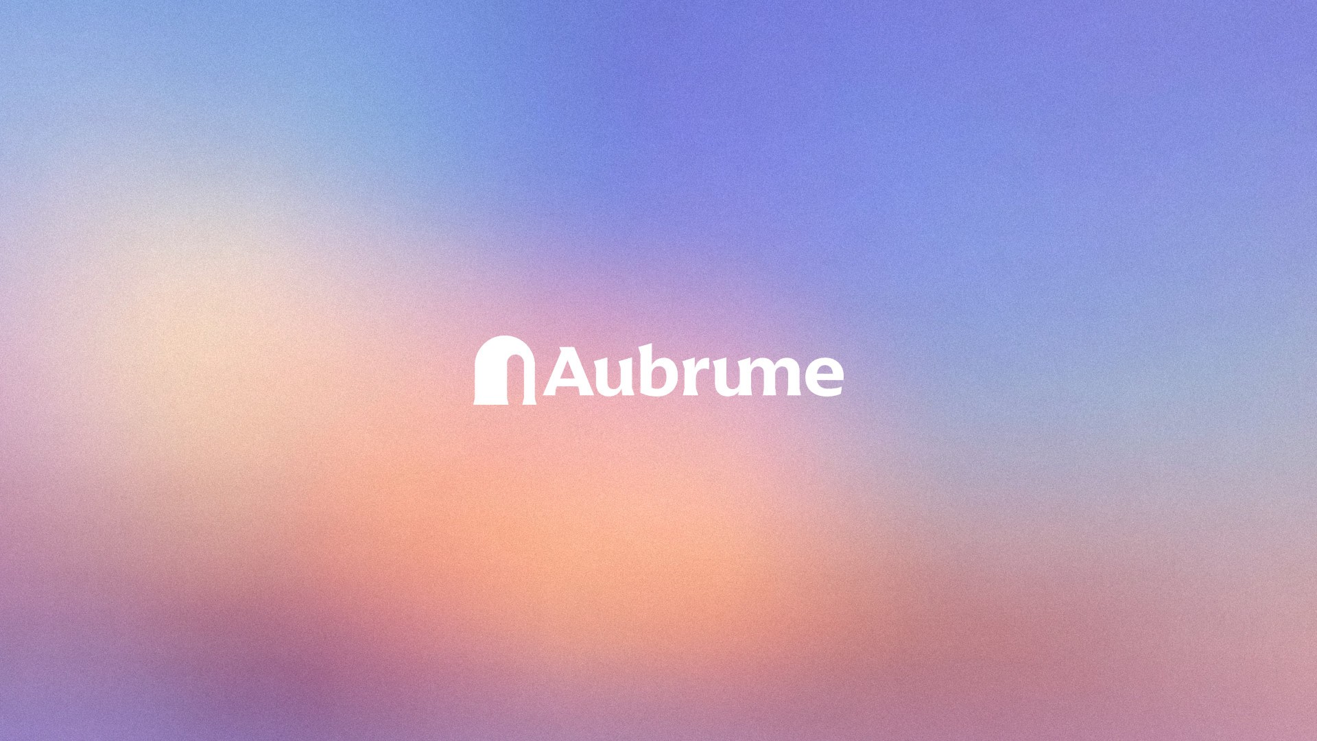
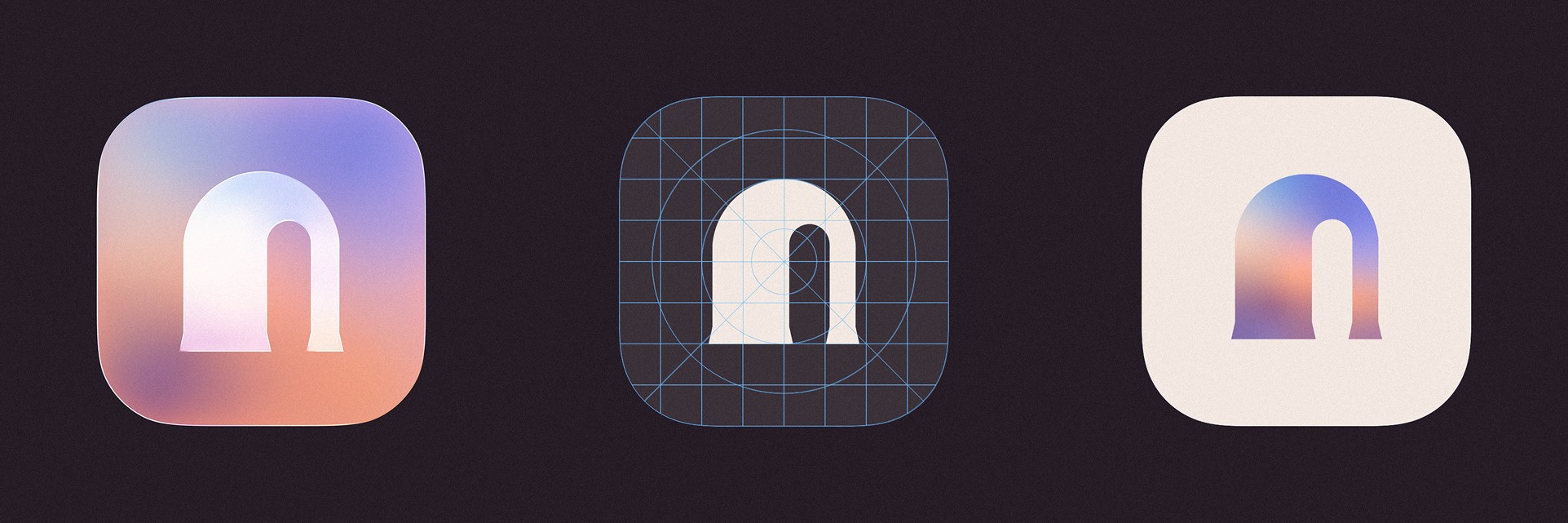
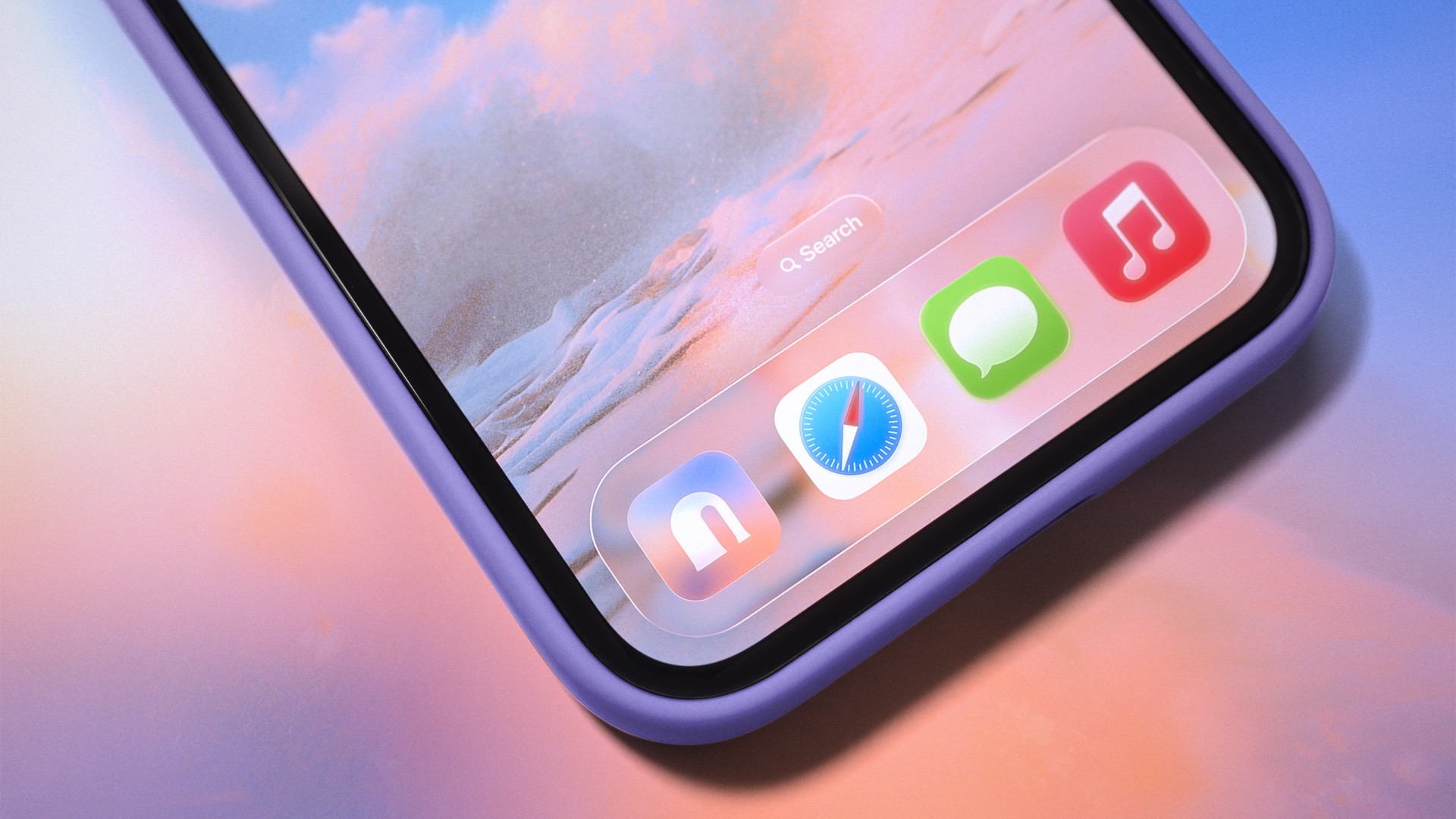
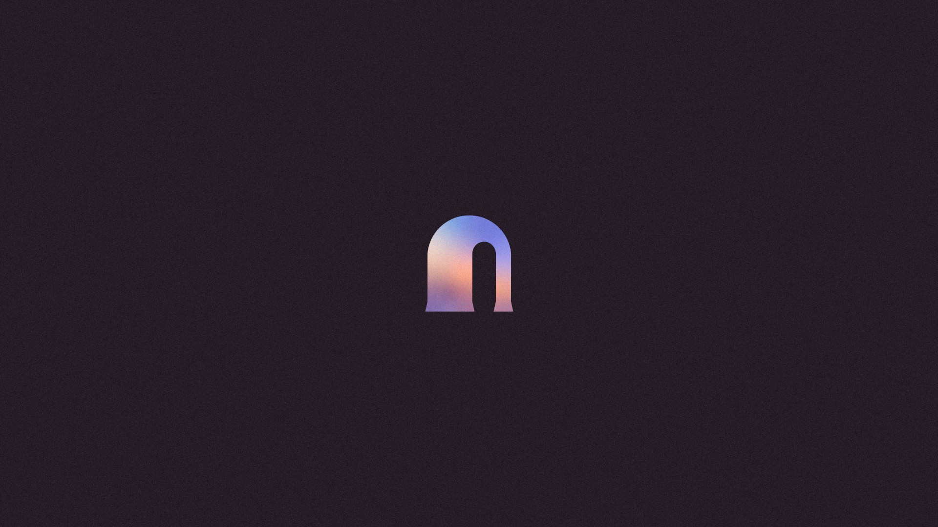
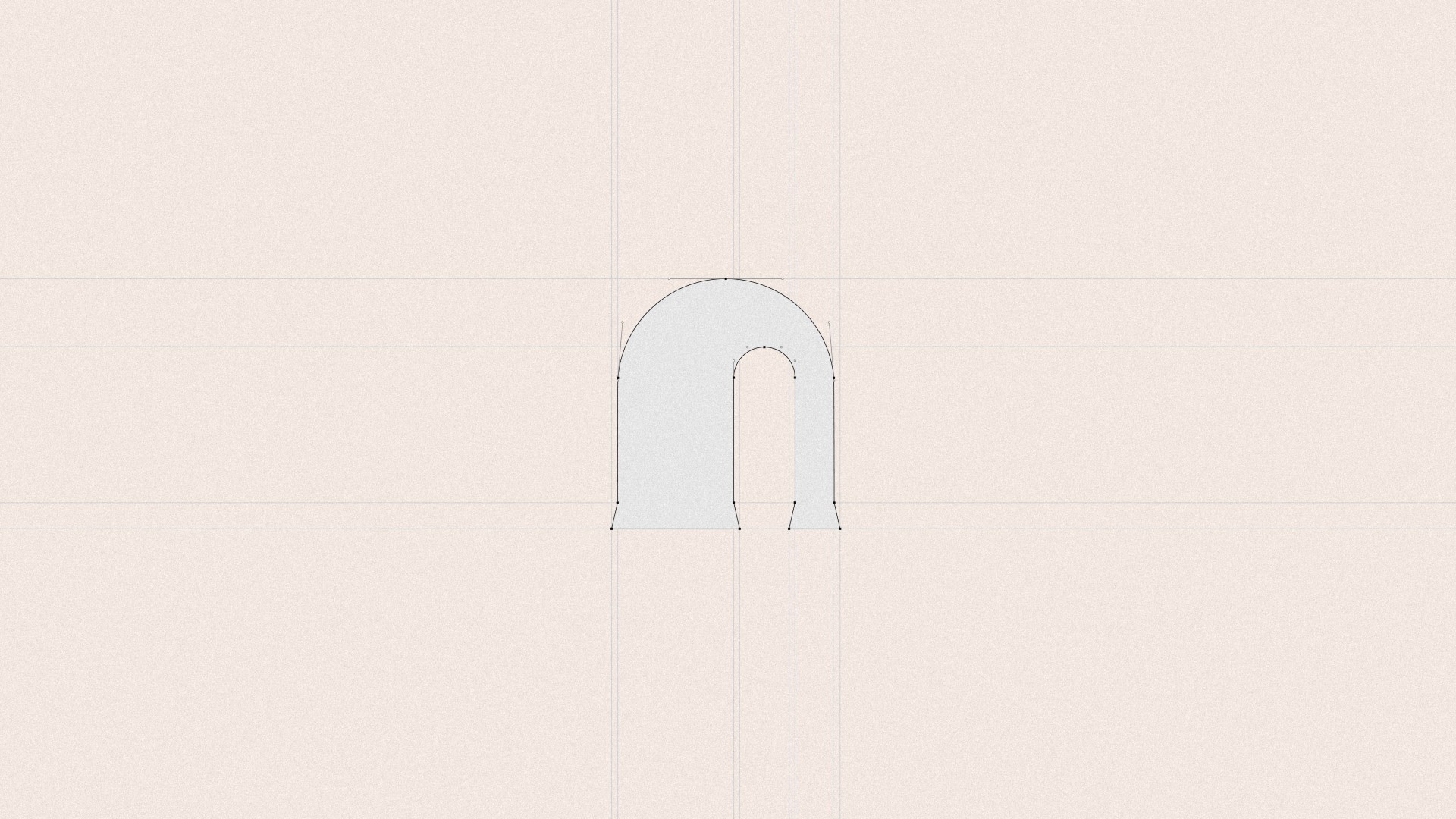
The logo combines a serif wordmark with a soft, arch-shaped symbol that suggests a portal, horizon, or opening. I wanted the mark to feel simple and calm rather than overly descriptive, so it could support the atmosphere-led concept without falling back on familiar travel or AI clichés. Its rounded geometry also became a useful structural element across the wider identity, shaping crops, frames, and compositions.
The logo system was developed and refined in Illustrator, where I could control the balance between softness, clarity, and recognizability more precisely. The intention was to create something atmospheric and memorable, while still minimal enough to work across digital applications.
Typography and Color
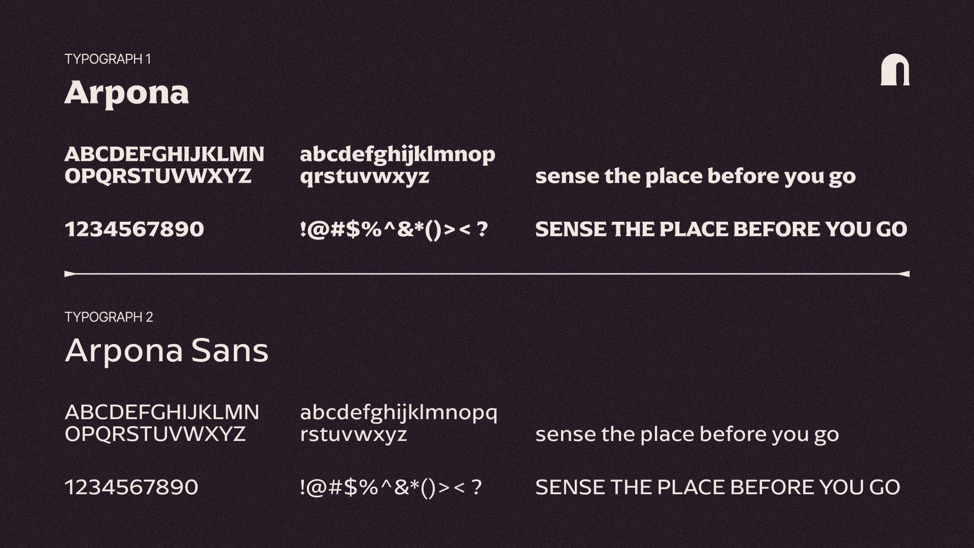
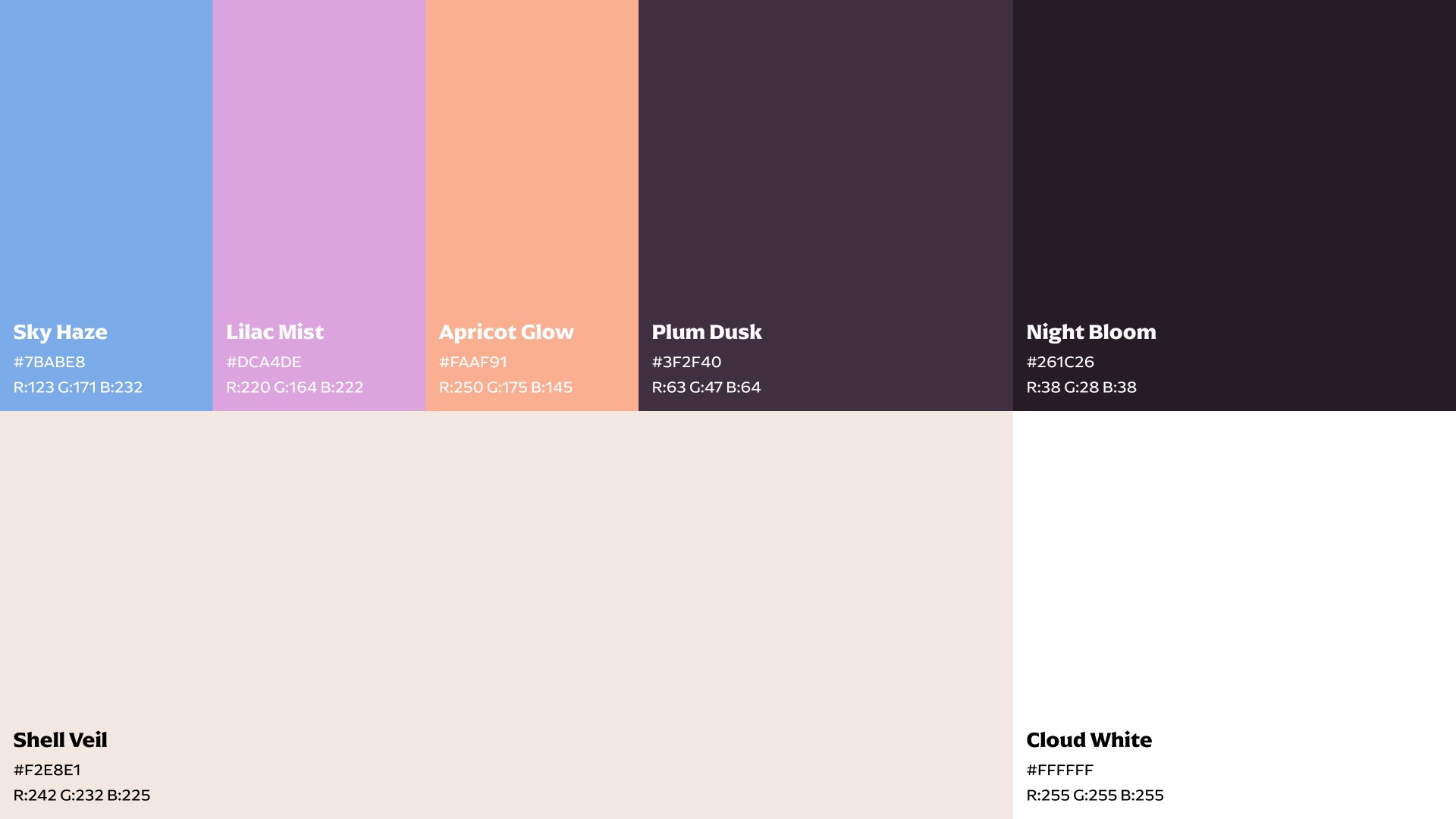
For typography, I used Arpona for the main wordmark and display moments, paired with Arpona Sans for body copy and interface use. That combination gave the brand an editorial tone without losing clarity in more functional settings. The color system was built around airy blue, lilac, apricot, and deep plum tones, balanced with soft warm neutrals. Together, they create a dreamy golden-hour atmosphere while still feeling controlled enough for product design.
Typography, hierarchy, and interface balance were explored through layout studies in Figma, helping define how the brand could move naturally between expressive storytelling and more functional product moments.
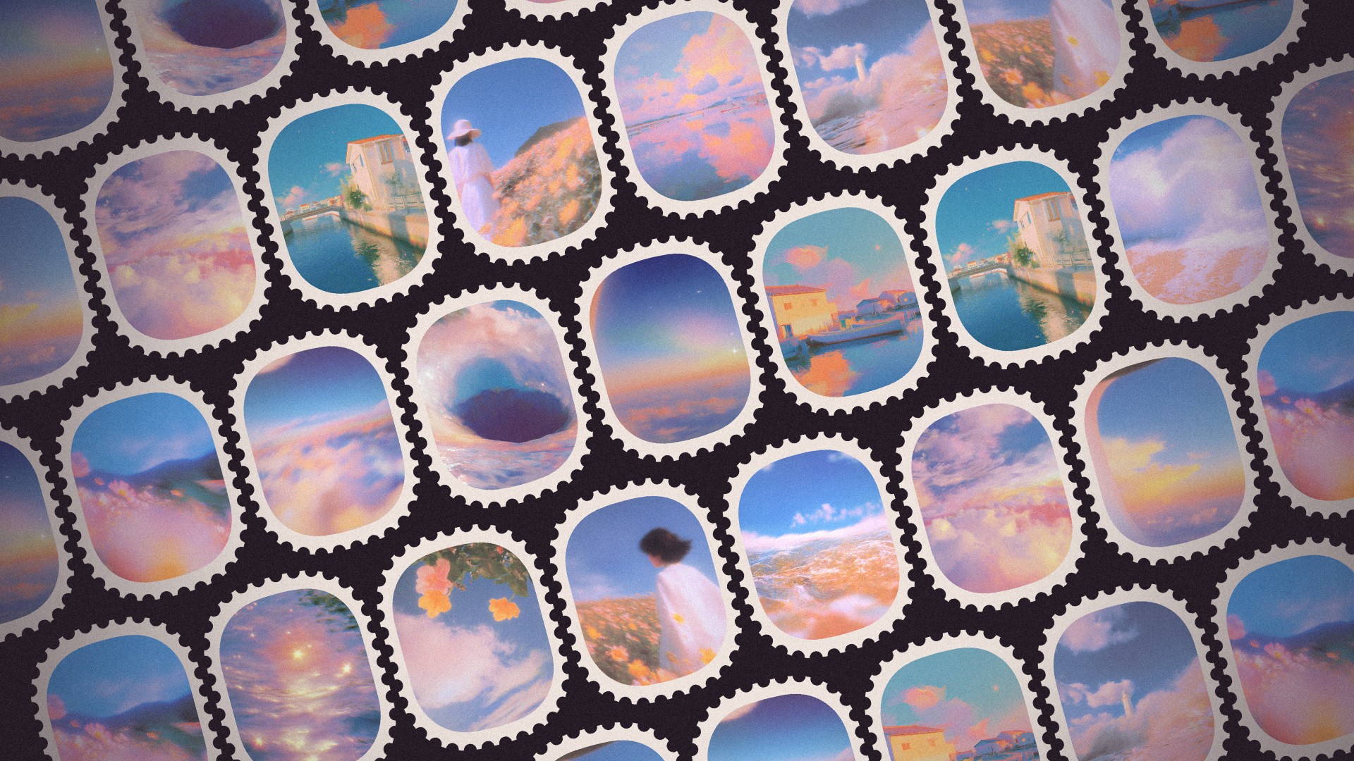
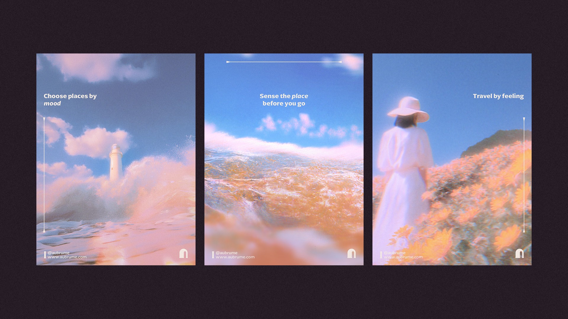
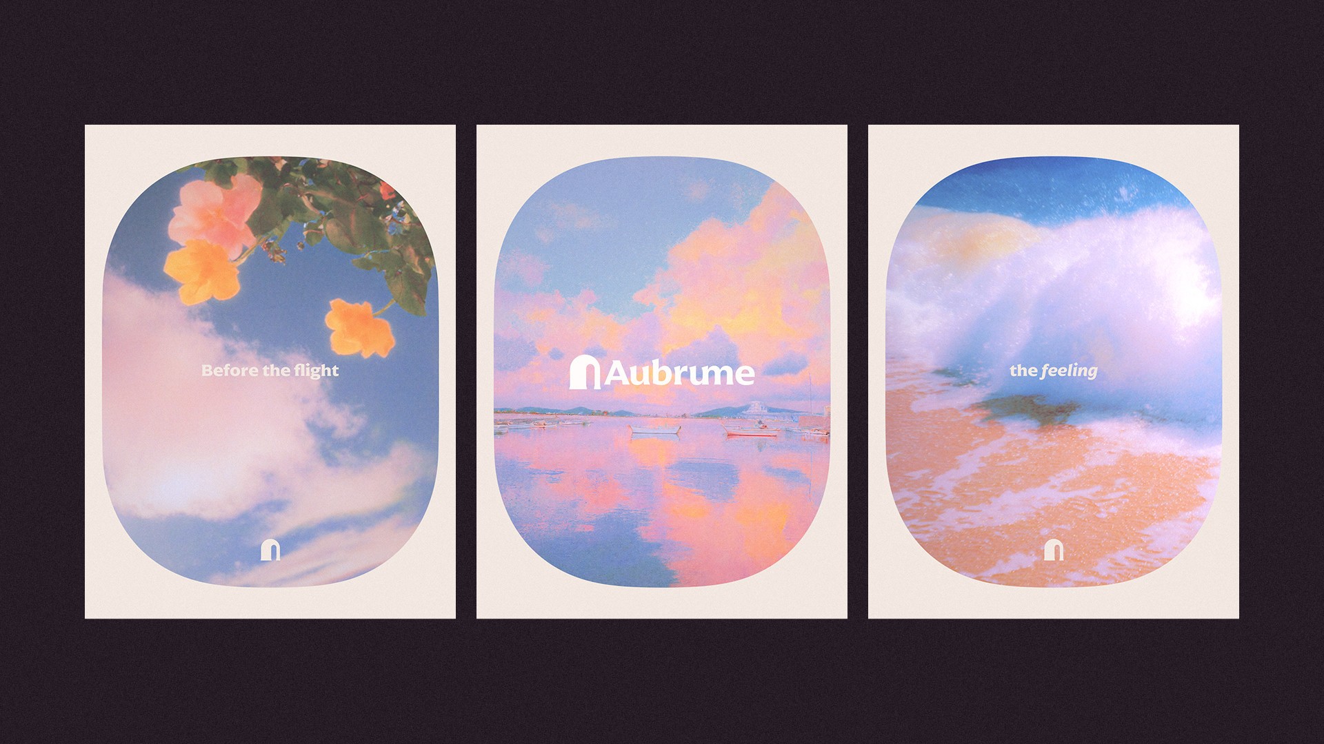
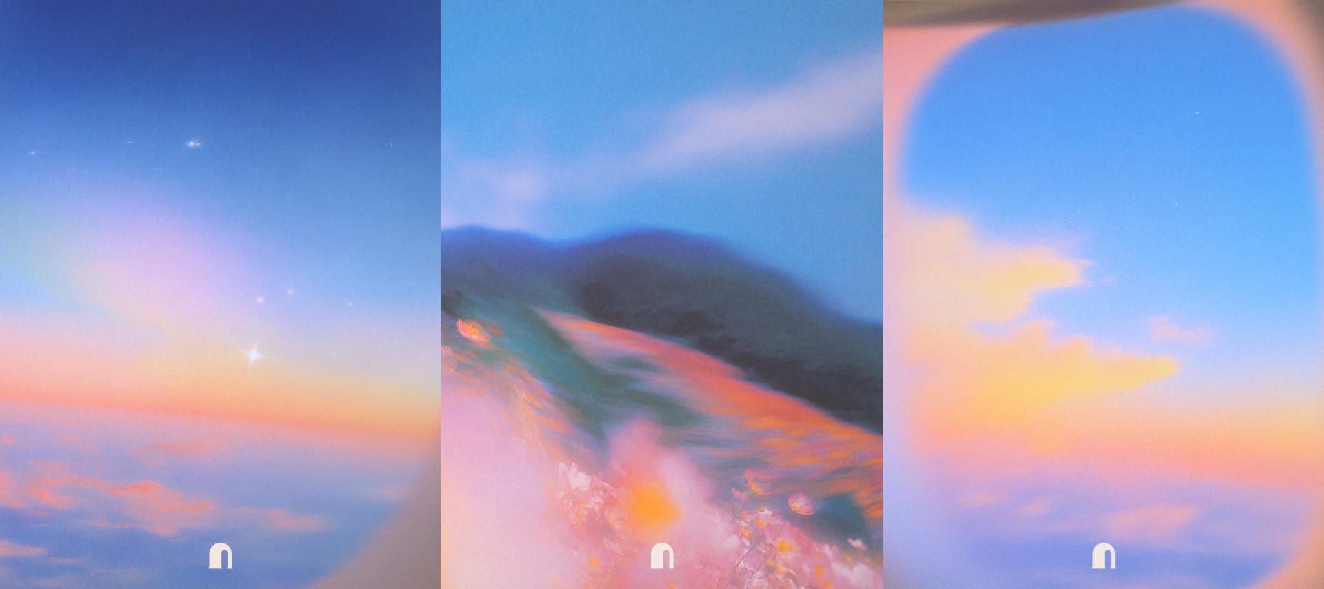
Brand Imagery
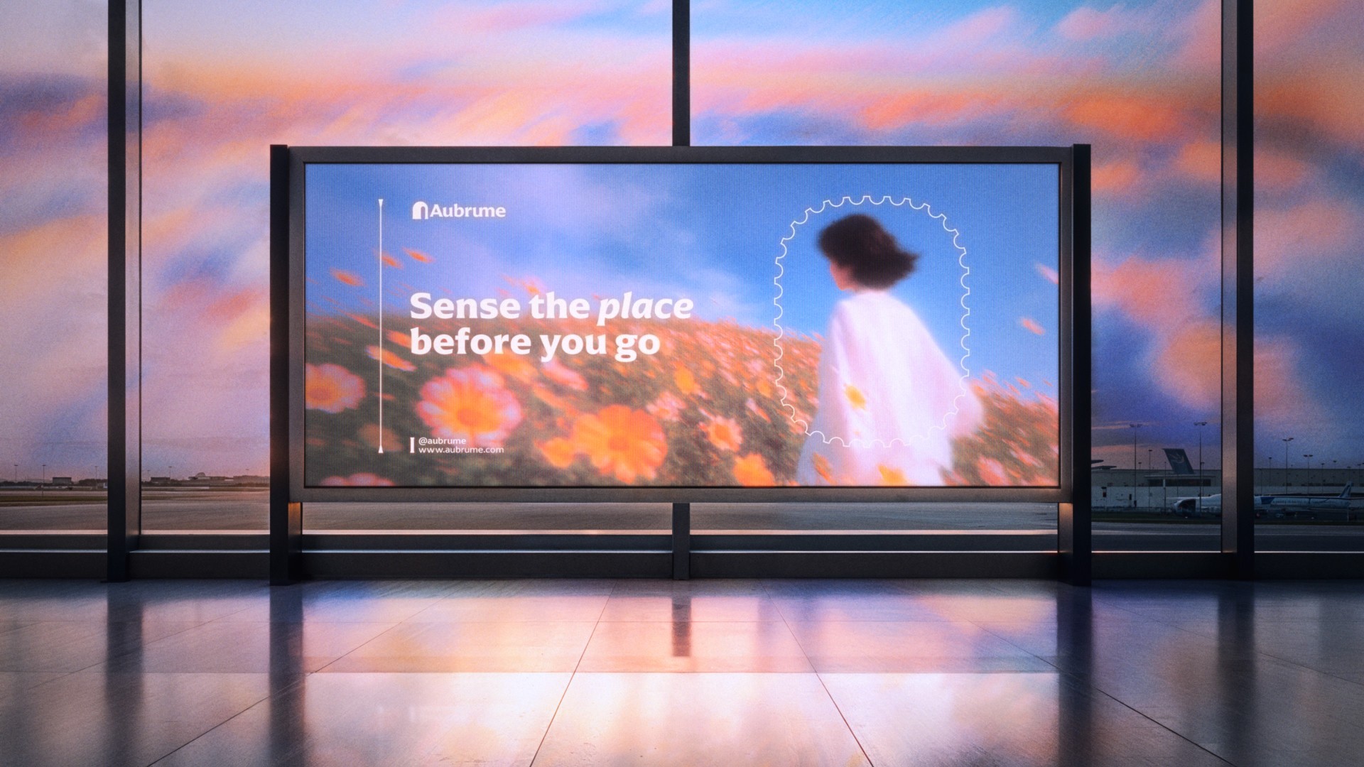
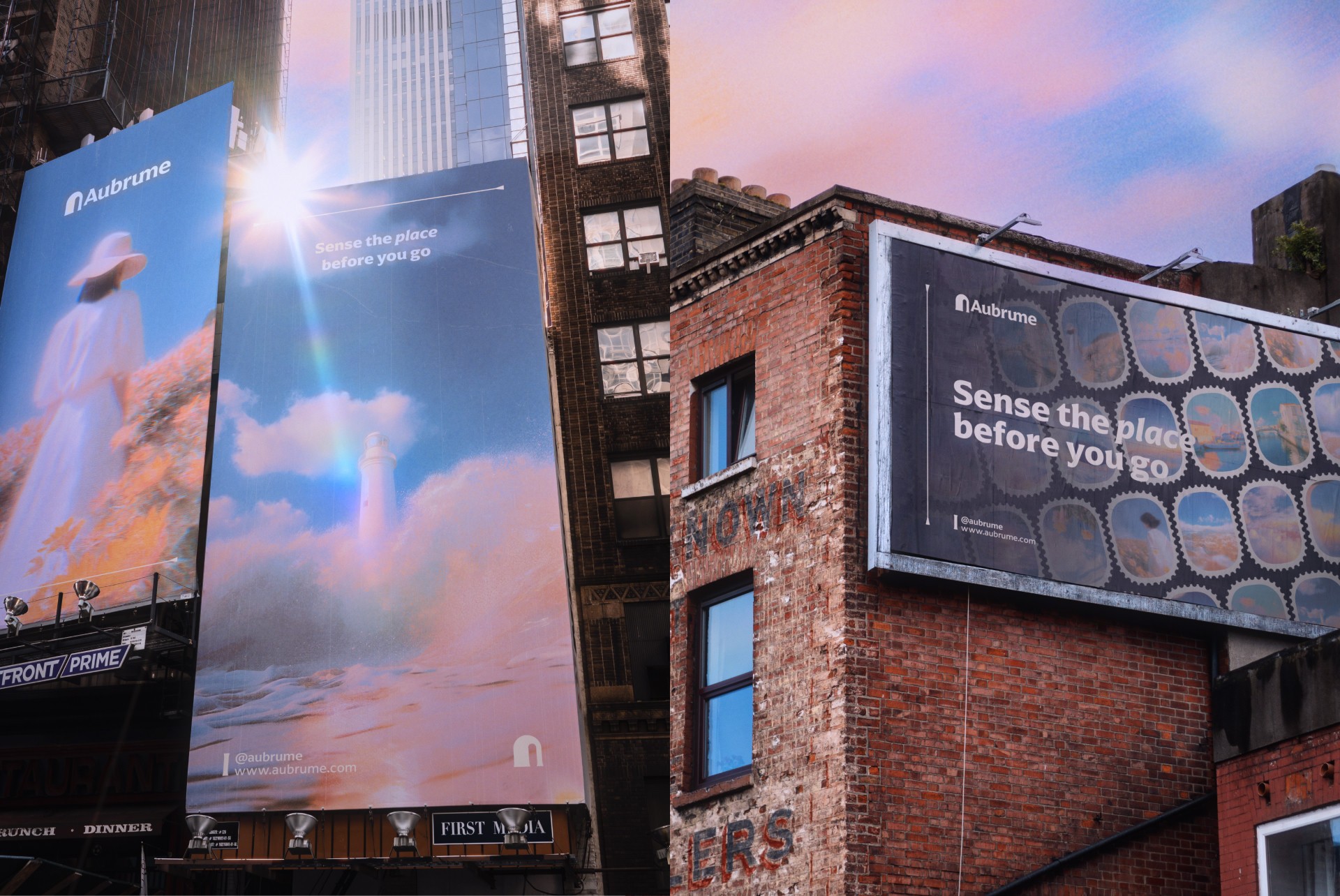
The imagery direction was built around digital impressionism, with soft blur, reduced detail, luminous skies, reflective water, floral fields, and quiet destination cues treated more like emotional previews than literal travel photography. The goal was not to show destinations in a documentary way, but to make them feel sensed, remembered, or anticipated.
To build that visual world, I started with a curated moodboard and developed a custom style reference made exclusively for this brand, so the look and feel could stay consistent across all generated images. I then used Midjourney V7 for image generation and visual exploration, alongside Nano Banana 2 and the Freepik AI Suite for further experimentation and refinement. Freepik AI Suite was especially useful for things like upscaling, texture enhancement, and working more freely on an infinite canvas while testing directions.
From there, the final imagery was selected, refined, and edited in Photoshop to create a more cohesive and human visual language. That process made it possible to explore a wide range of directions quickly, while still relying on taste, curation, and manual control to shape the final outcome.


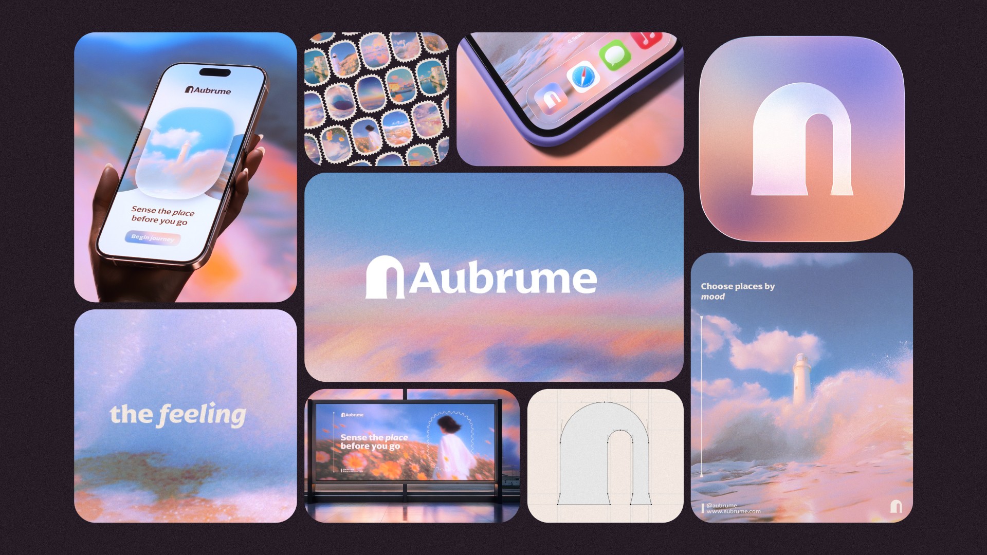
Final Branding
The final identity brings together logo, typography, color, imagery, and digital brand thinking into a cohesive world that feels atmospheric without becoming vague, and contemporary without relying on generic tech aesthetics. More than a visual exercise, the project reflects the way I use AI in my workflow: not as a shortcut to finished work, but as a creative tool for exploration, speed, and variation, always shaped by human direction, curation, and refinement.
By combining tools like Illustrator, Photoshop, Figma, Midjourney V7, Nano Banana 2, and the Freepik AI Suite within a structured branding process, the project became a way to explore how AI-assisted workflows can still lead to work that feels thoughtful, beautiful, and human.